
Studio Nerd.
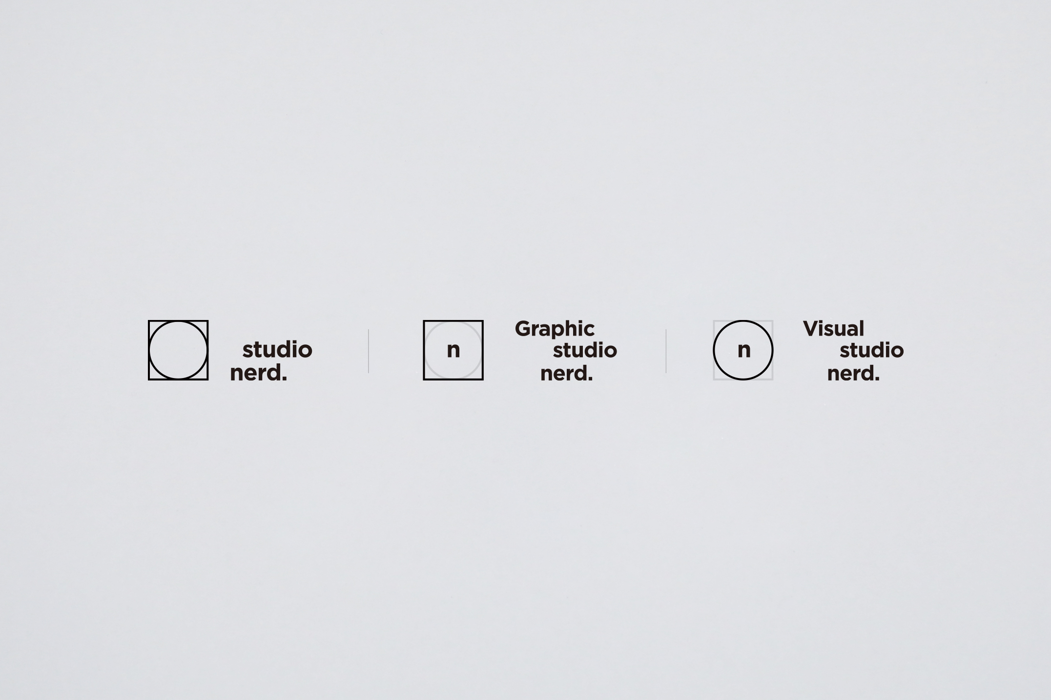
사진, 영상 스튜디오에서 그래픽 디자인 스튜디오로 영역의 확장이 이루어지면서, 브랜드 아이덴티티를 새롭게 디자인 했다. 예전 아이덴티티는 원형의 카메라 조리개를 기반으로 만들어져 있었다. 새롭게 디자인을 진행하면서 조리개를 활용한 로고를 원형으로 단순화하고 사각형을 추가하여 각각 비주얼과 그래픽의 상징으로 사용했다.
With the expansion of areas from photography and video studios to graphic design studios, i have redesigned studio’s brand identity. The old identity was based on a circular camera aperture. In the new design, the aperture simplified the logo into a circle and added squares to make it a symbol of the visual and graphics.
Client: studio nerd.
Contribution: 100%
2018